Burger Brawl

Brand Strategy | Print Collateral
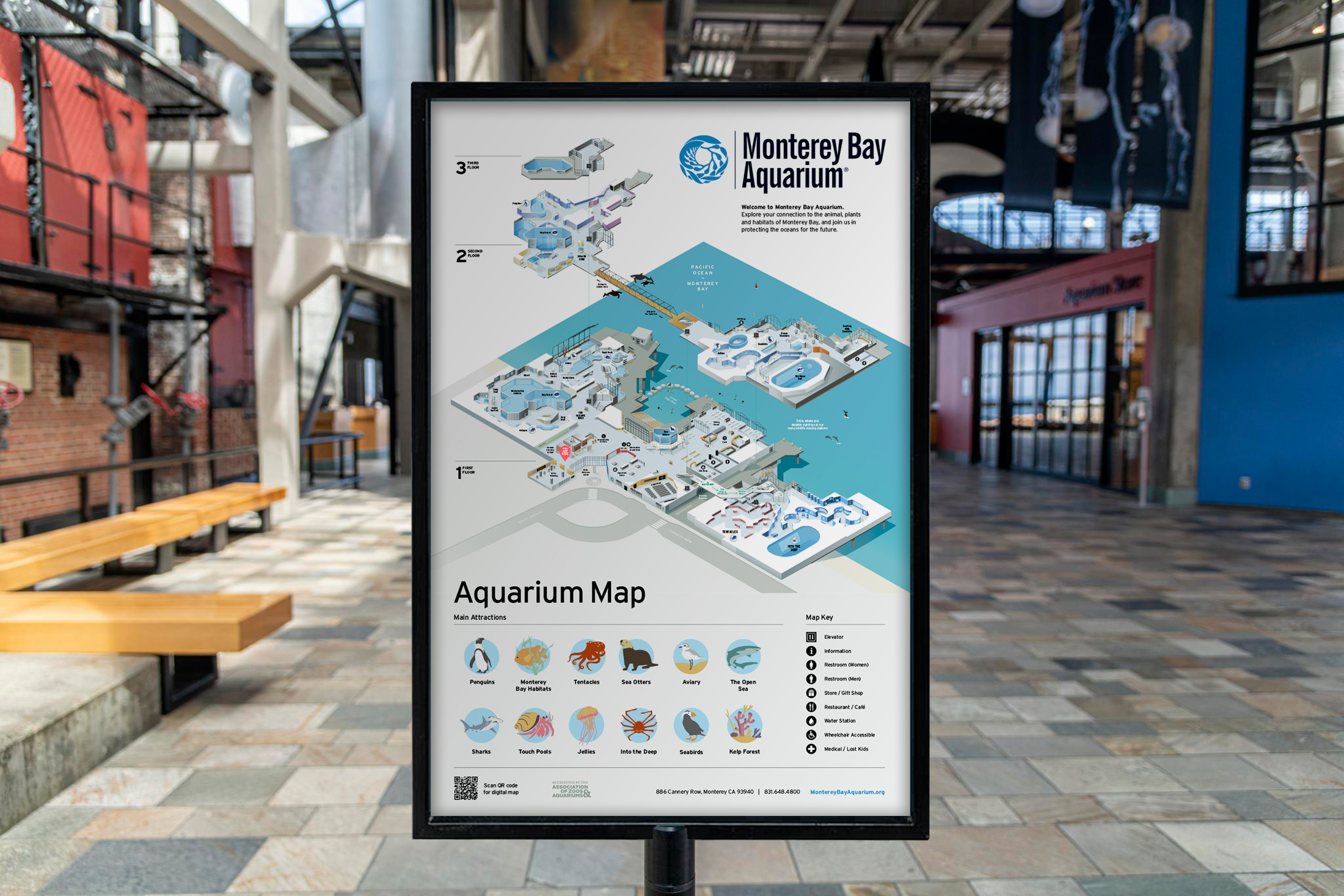
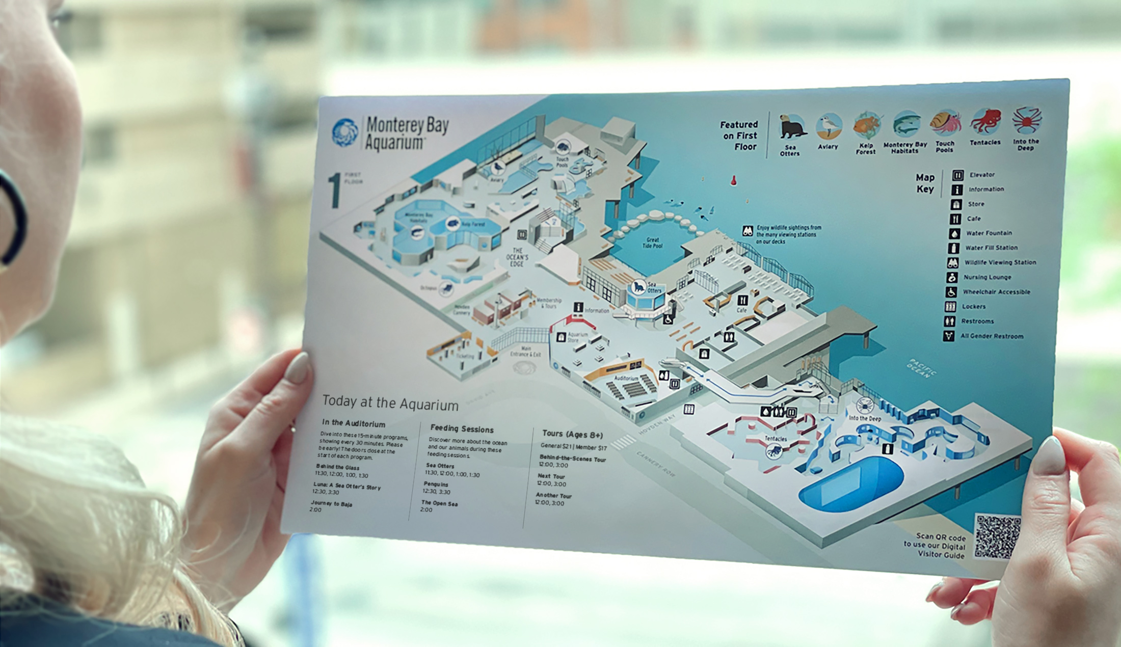
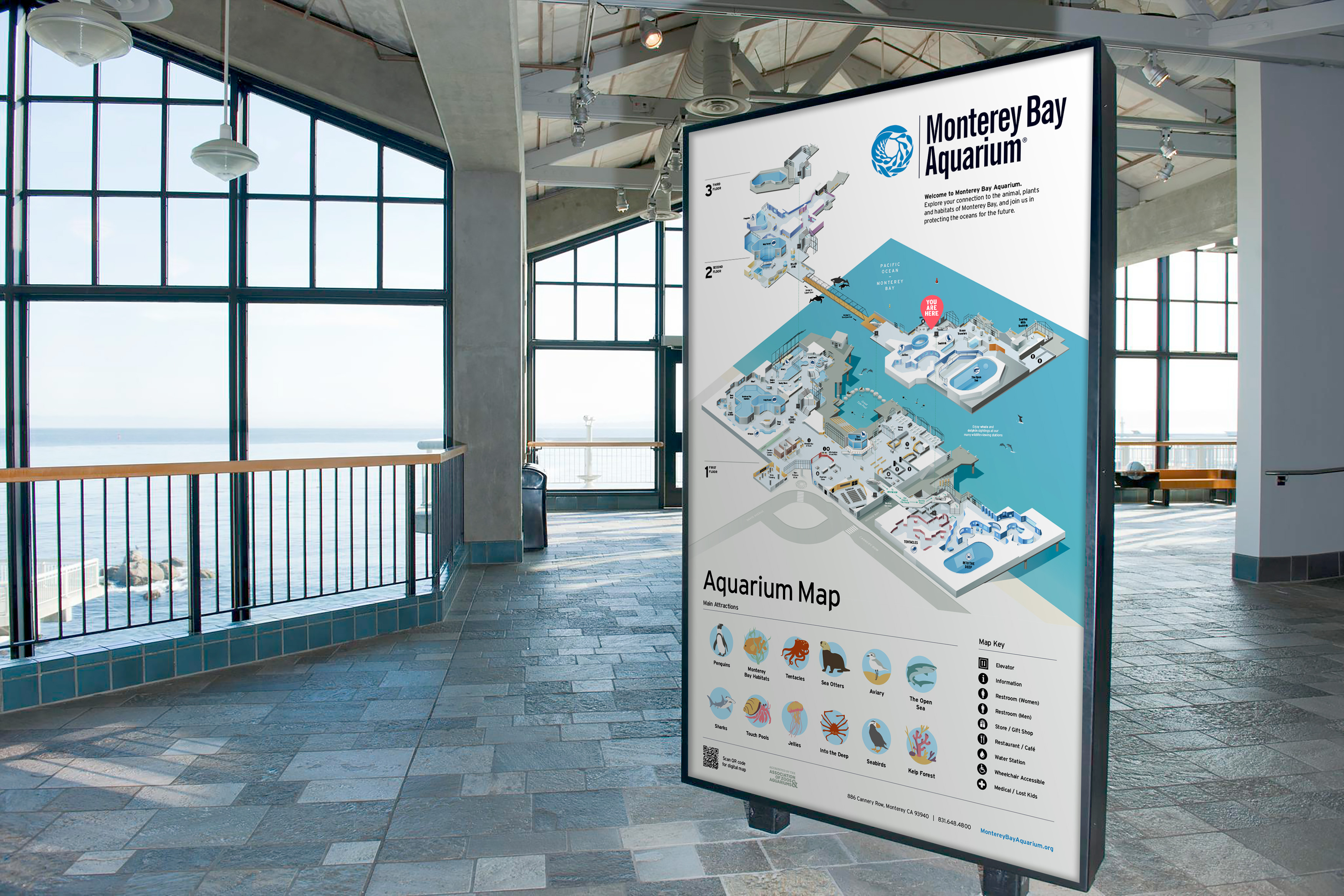
Monterey Bay Aquarium contacted AgileCat from across the country seeking a fresh take on their wayfinding map system. Working closely with Monterey Bay’s leadership, internal creative team, exhibit curators, membership and visitor’s service staff – we determined substantial goals from each group and resolved the best way to represent such a unique aquarium experience — for visitors and staff alike.
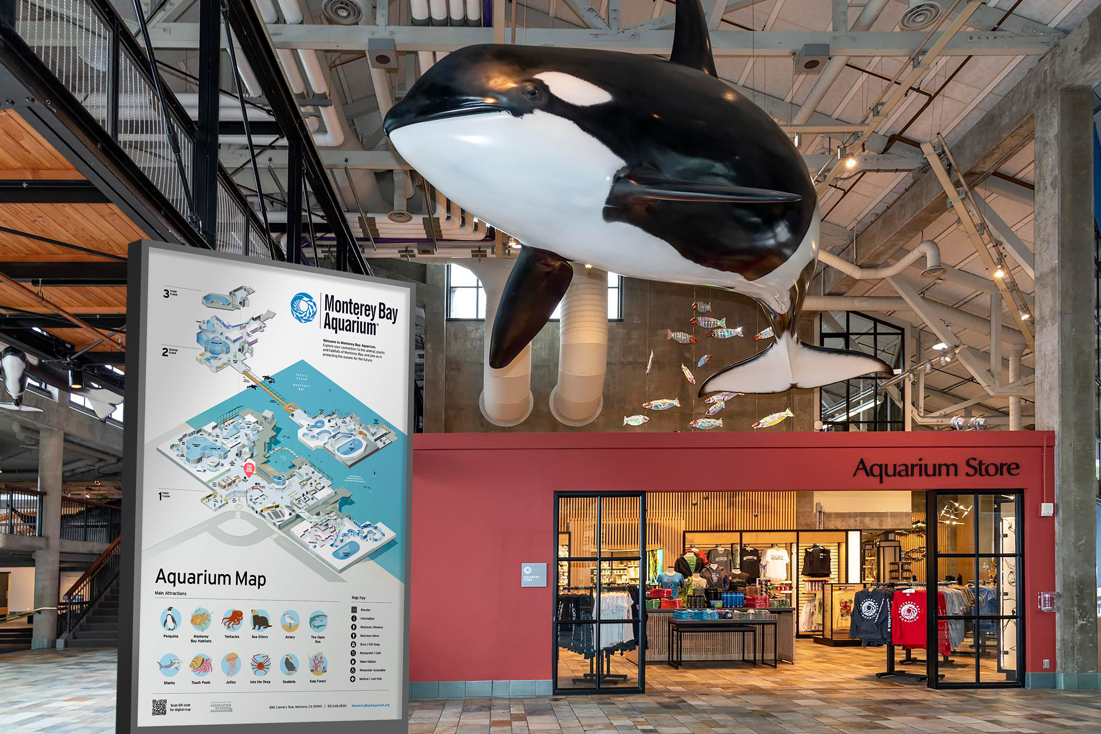
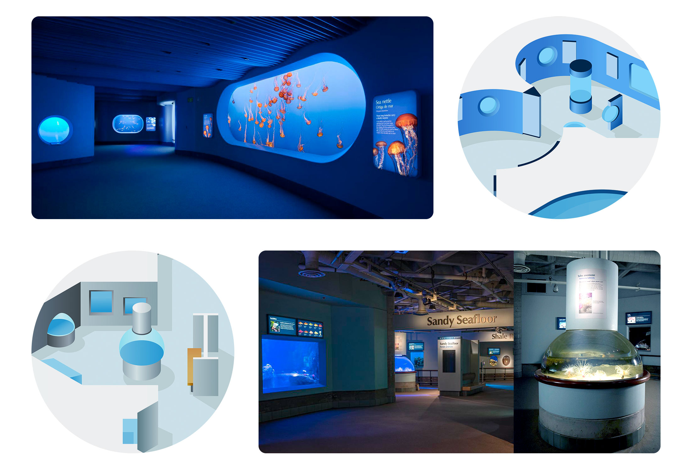
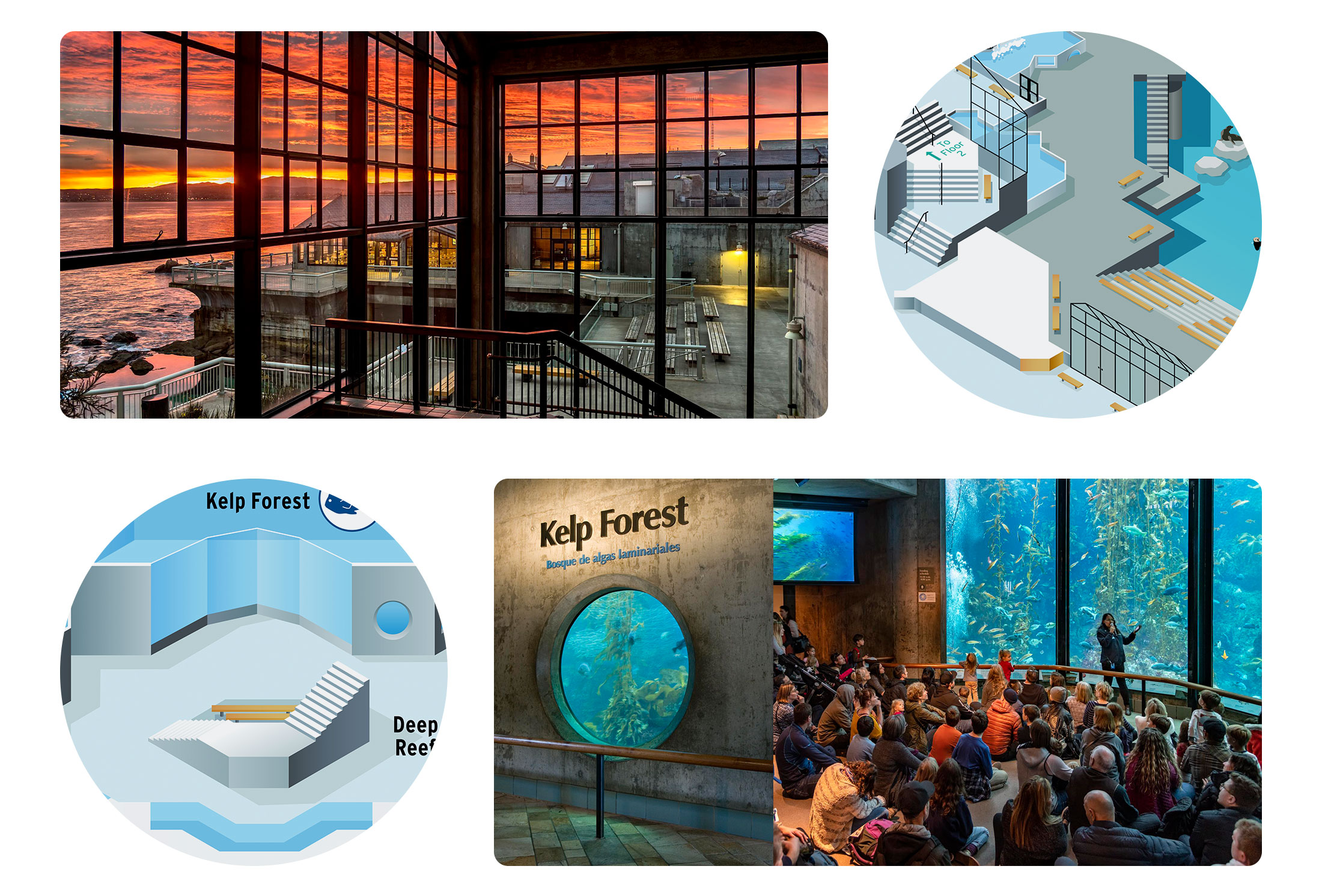
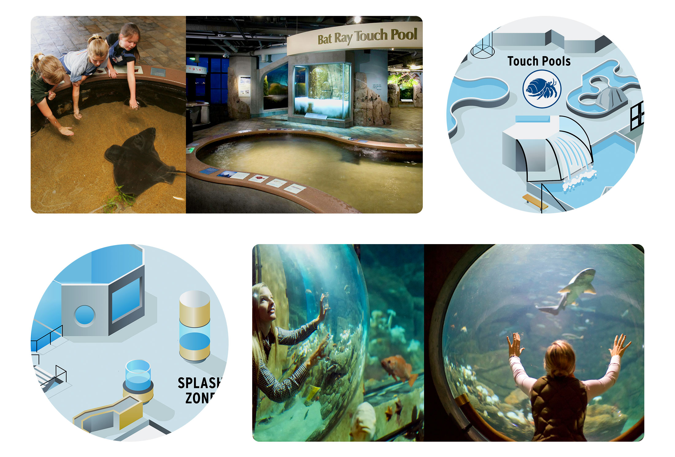
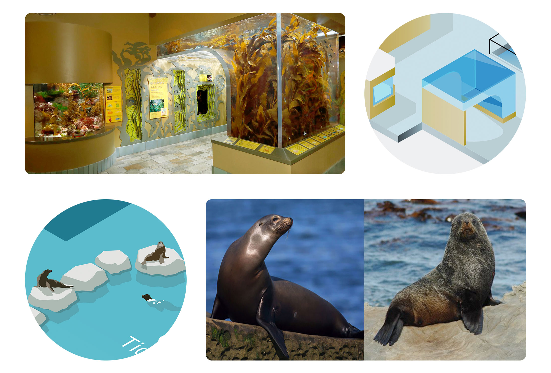
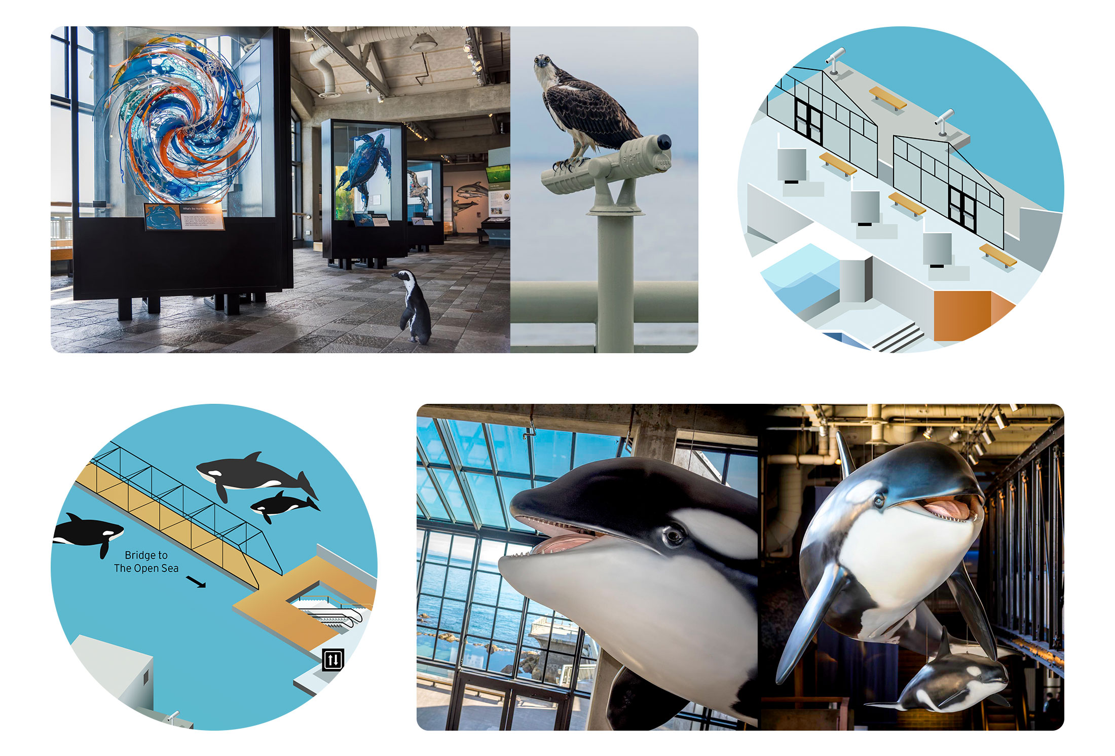
The winding halls and expansive ocean views of such a novel architectural space required a deep dive into blueprints, images, video, and 3D tours to capture all that was so special about each environment — and express it in a simple, appealing, and approachable way. AgileCat created a completely custom map drawing, with a graphic style that can be modified and evolved as future exhibits come and go. This new map design, featuring a refreshed icon system for key exhibits, helps visitors navigate the curvy multi-floor labyrinth of deep sea portals, sea-life tanks and expansive ocean views. This new artwork comes to life as handouts given to visitors at the aquarium, as part of their interior wayfinding system, and is viewable on mobile devices and digitally on their website.

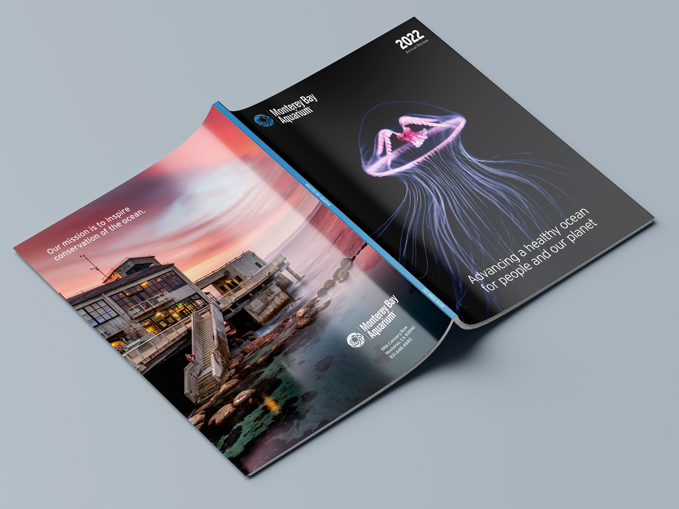
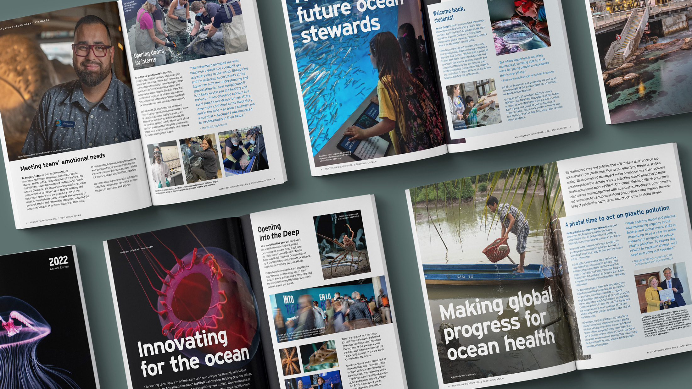
During the process of working through all of the map's technical and creative details with the Monterey Bay Aquarium team, we got to know each other really well — that trust and camaraderie has continued to flourish into new projects and future plans together. MBA asked AgileCat to handle their Annual Review book for the upcoming year. This gave us the opportunity to work with their marketing, membership and financial teams to showcase even more of their amazing organization through editorial design and storytelling. Orchestrating elements of their deep history, current events and future plans — with some stunning photography — allowed us to conjure 'just the right' tone in a book they'd be proud to share with their stakeholders and long-time supporters.
