Meet The New You


AgileCat is proud of our multi-year relationship with Trice Medical, a true disruptor in the medical/tech space. As the inventor of the mi-eye, Trice has truly rocked the healthcare industry with a product that is as effective as it is ergonomically sound. Given the mi-eye is a device that enables an orthopedic surgeon to most effectively – and efficiently – evaluate a joint injury, AgileCat used this as the foundation to our complete overhaul of the Trice brand identity.

 The structure of the brand identity ultimately expresses how Trice is truly carving new pathways in the industry to the benefit of both doctors and patients. Additionally, the identity symbolizes the literal pathways that the mi-eye creates in attaining the most precise diagnosis of a joint injury. Naturally, the “carving” within the circular symbol creates a very attractive and unique “T” for Trice.

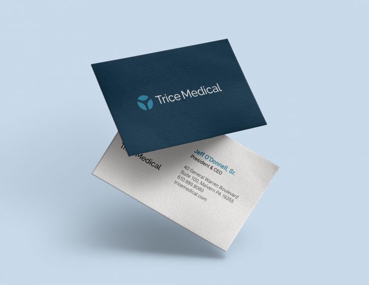
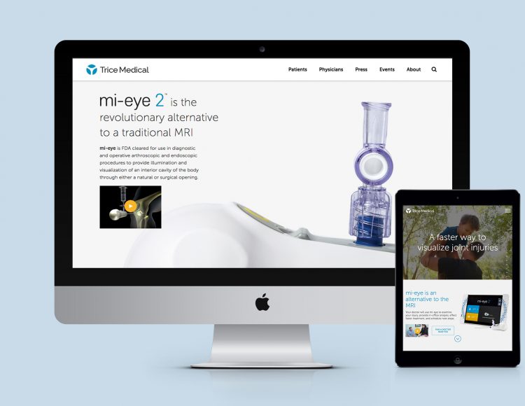
This new Trice Medical logo is now living on the walls at their beautiful new headquarters as well as within all marketing vehicles, from business cards and stationery to website, sales materials, tradeshow exhibits, and advertisements. We are most proud of this new work for our client – one with a true pioneer spirit that we are proud to call a partner of AgileCat’s.