AgileCat Logo Evolution
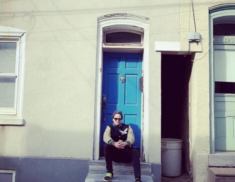
The first logo for AgileCat symbolized when Peter Madden, our Top Cat, was an agency of one, and was in full hustle mode (still is) from his rowhome at 318 Carson Street in Manayunk, always pouncing on opportunities and building the big dream that is the ‘Cat today.
The radical overhaul into what became our current logo is hyper-clean, and the more you stare at it, you see multiple symbols that represent AgileCat in a most powerful way. You see a Cat ear (we’re big on listening), a Cat eye (we are always focused on our clients and their dreams), and even the silhouette of a Cat head. As orange has always been our color, that hot but cool shade remains. Just as our spirit for being “Relentless Since 2001” remains. Here’s to the beauty of taking your own medicine and loving every drop!